SheetBrand and packaging
SourceThe original artwork files
Pieces30, read from the list
Left outAgency work on other people's brands
Brand and packaging · 2016 to now
Labels, boxes and a stand at the NEC.
Six years as the only designer at NOVAVAPES, then the clients who came to my studio for a brand before they wanted a website. Print is where I learned the rule I still build by: once it's at the press, you don't get to take it back.
NOVAVAPES · in-house · 2016 to 2022
Every bottle and every pouch, for six years.
I was the only designer from startup to established brand, so every range on the shelf was mine to draw: NovaJuice, Rose and Ivy, ICE and the specials around them. A label has to carry the warnings the law puts on a nicotine product and still sell the flavour from across a shop.
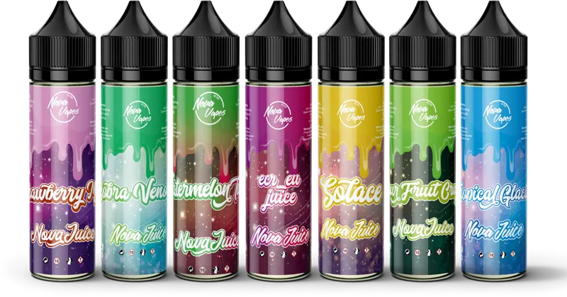
NovaJuice, the core range
One template, a colour and a drip for each flavour, so the range reads as a family on a shelf and a flavour up close.
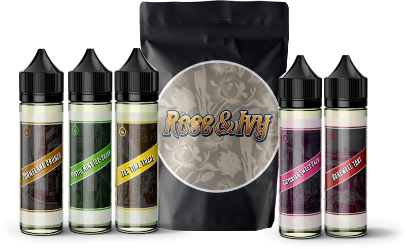
Rose and Ivy
The dessert range, dressed as an old sweet shop. Pouch and bottles.
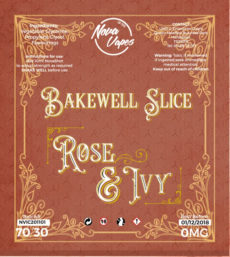
A Rose and Ivy label at proof
Bakewell Slice, flat, with the batch and strength panels and the regulatory text in place.
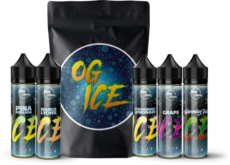
OG ICE
The menthol range, pouch and bottles.
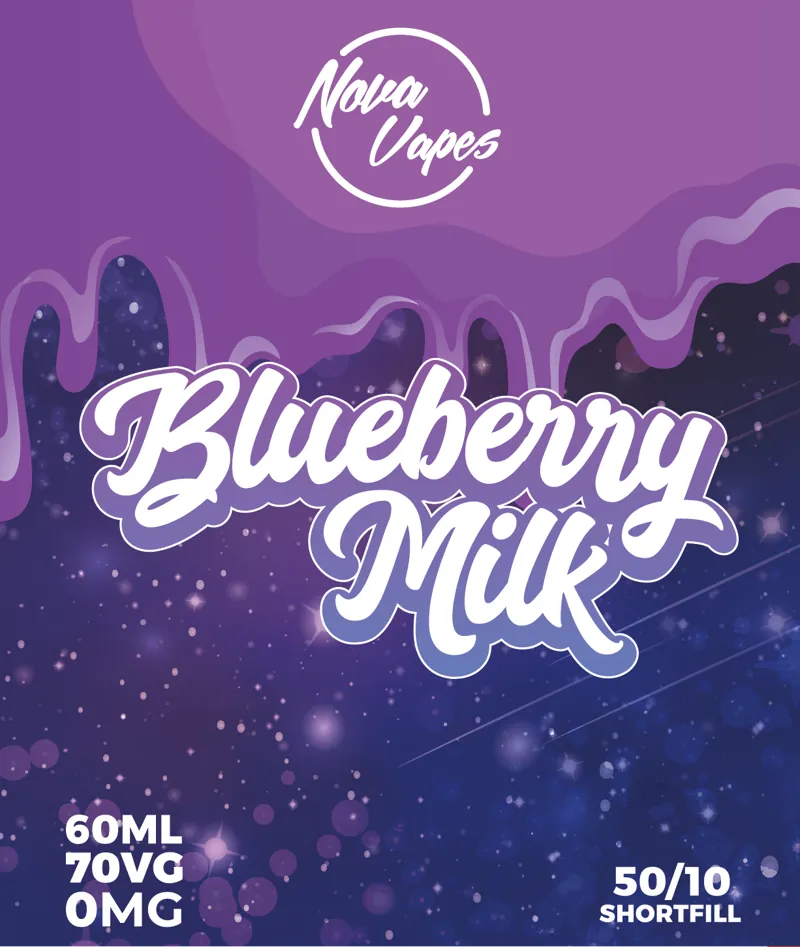
Blueberry Milk
A shortfill label from the NovaJuice range, laid flat.
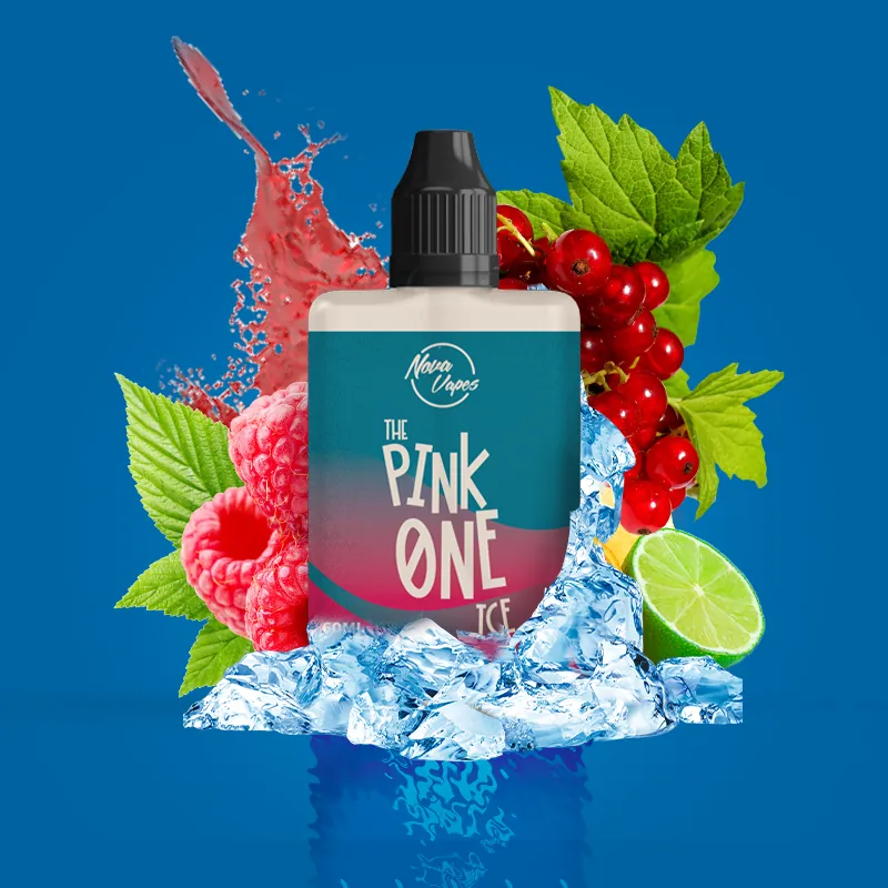
The Pink One ICE
A launch post. The bottle is the product shot, and the fruit and ice are the flavour.
The Vaper Expo · NEC Birmingham · October 2018
Redrawn overnight, from 4:50pm to 3am.
Stand D745 was NOVAVAPES' first stand at a national trade show, and we'd paid a stand design agency to design it. They had three months. The MD and I phoned every two weeks for progress and never saw any. At 4:50pm the night before it went to print, they sent us what they said was exactly how our stand would look, going to the printer at 9:30 the next morning. An hour later I was redrawing it, with the MD on a video call giving his feedback as I went. We finished at 3am, and the full print files were in by opening time. In one night I out-designed an agency that had three months.
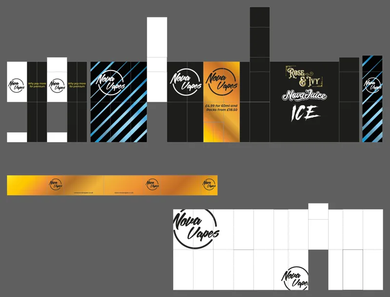
What the agency sent
Not mine, and shown here for the comparison. Black walls, orange and blue stripes and a gold price panel: nothing in it looked like the labels people already knew us by, and this was what three months had come to. Printed, it would have made us look amateur at our first national show.
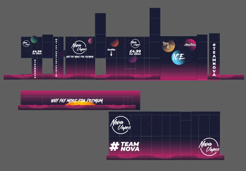
What we printed
The brand was built to be loud on a shop shelf, so the stand had to be too. One night sky runs across every panel so it reads as one thing from the aisle, with the three ranges on the back wall, #TEAMNOVA on the counter and the price at eye height. For all three days people told us how well it fit the brand, and it outshone stands from businesses worth millions. That weekend NOVAVAPES won 2,500 new customers and orders, and over £15,000 in revenue from products that sold at £5 each.
Atelier 93 · a perfume house · 2022
A perfume house, from the mark to the box.
The whole identity for a fragrance brand whose manifesto was "don't overcomplicate or overcharge for the everyday": the marks, the guidelines that say how to use them, a box for each scent and the posts that launched them.
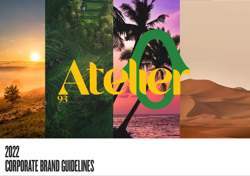
The brand guidelines
Thirteen pages: the manifesto, the four marks, three typefaces, and a colour pair for each of the six scents with the Pantone, CMYK and hex for every one.
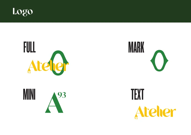
Four marks, one system
Full, mark, mini and text, each in colour and in black and white.
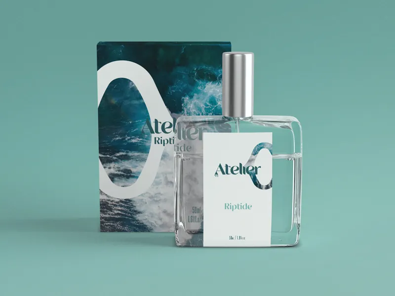
Riptide
Bottle and box for the first scent.
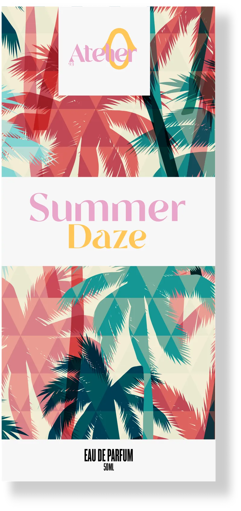
Summer Daze
Each scent has its own colours, and on its box the mark takes them on.
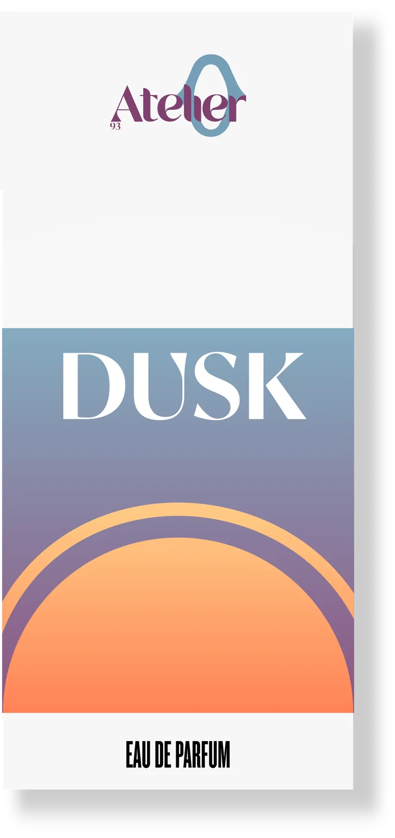
Dusk
The same frame again, with a sunset where the palms were.
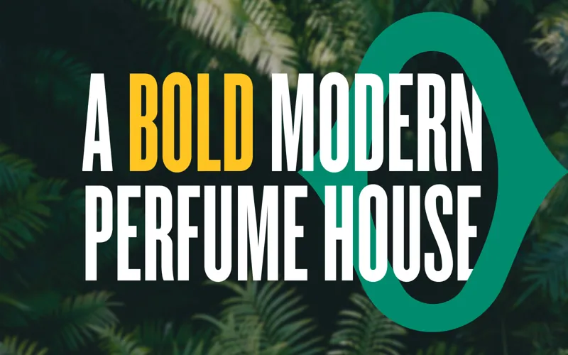
The launch
A post for the launch, set in the brand's display face.
Identities and lettering · DesignBuddy · 2017 to now
Logos, lettering and the odd burger stamp.
Most of my studio's clients came for a mark before they came for a website. Some went on to be built, some stayed as identities, and one was a set of options for a restaurant that wanted its name on aprons and on the burgers.
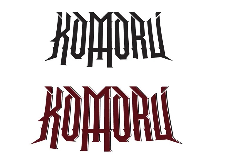
KOMORU
A local death metal band who didn't want the usual spiderweb death metal logo. They wanted a classic metal band mark, closer to Party Cannon's, so I drew one with an upside-down cross hanging from the M. The band leader called it "horrifically cheesy and on the nose, but it really kinda works, doesn't it?"
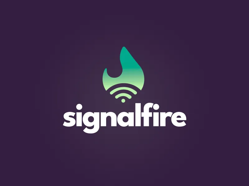
Signalfire
A flame that is also a signal, in one gradient.
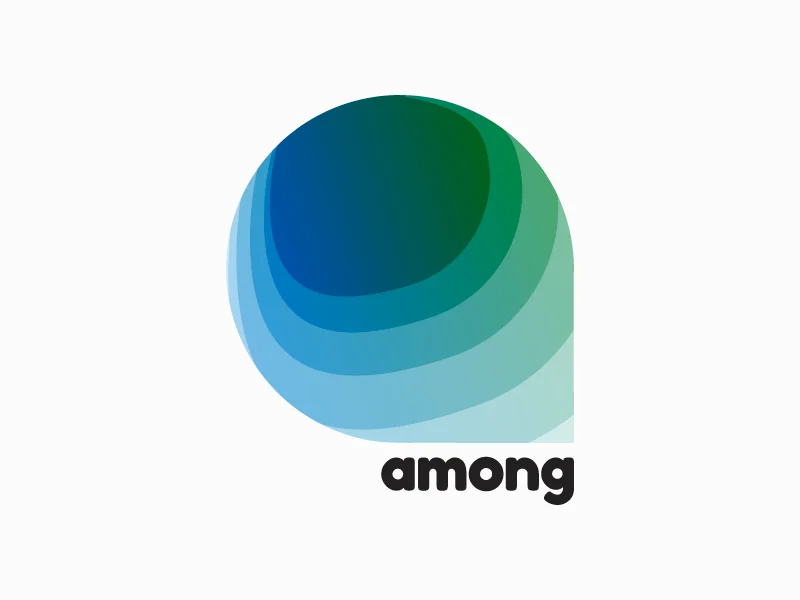
Among
The identity for an SMS job search startup in Denver. The founder loved hiking and the outdoors, so the mark is a speech bubble layered in greens like a contour map, which also nods to the steep terrain the city is known for.
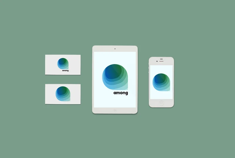
Among, on cards and screens
The final mark on business cards, a tablet and a phone, where it has to work as an app icon too.
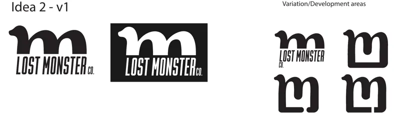
Lost Monster
A development sheet: the L and M combined into one monster-shaped letter, with the variations I'd push next.
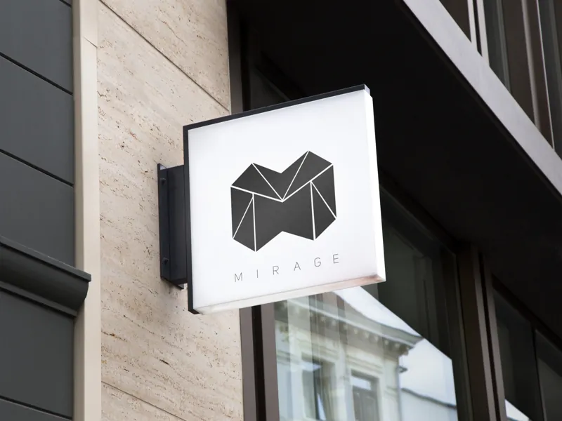
Mirage
A geometric M, mocked up on the sign it was drawn for.
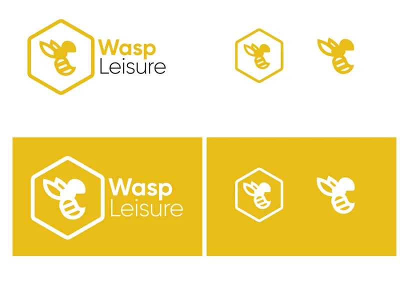
Wasp Leisure
A wasp in a hexagon, with a version for every size it has to work at.
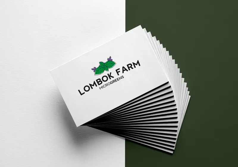
Lombok Farm
Business cards for a microgreens grower.
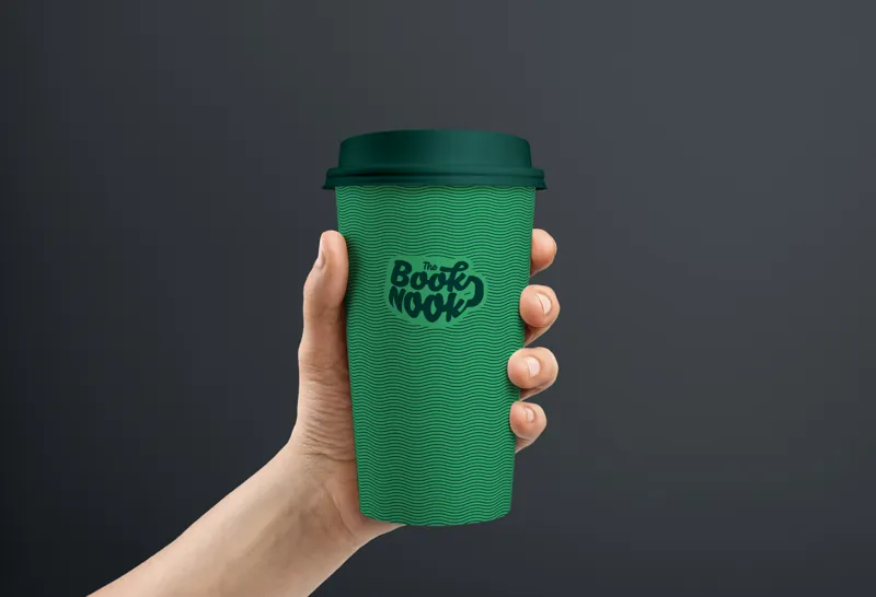
Book Nook
The mark on the thing people would actually hold.
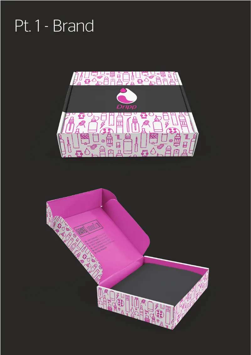
Dripp
Brand and packaging, from the proposal: the mark repeated into a pattern for the box.
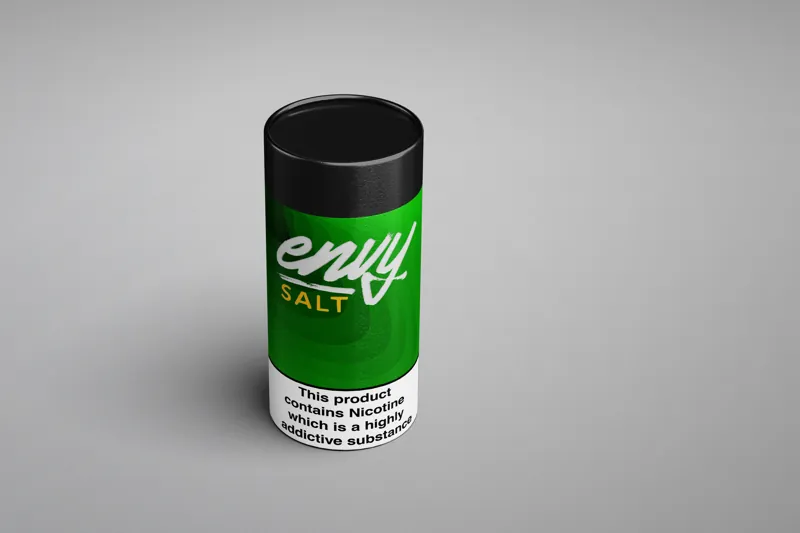
Envy Salt
A nicotine salt label that had to fit the warning and still look like something.
Covers, posters and a tour shirt
Gig posters and album covers.
Bands came to me for covers and tour posters, which is the best brief there is: it has to read from the back of a room and still work at the size of a thumbnail on Bandcamp.
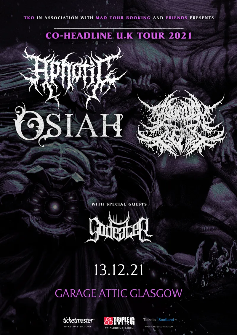
Aphotic and Osiah, UK tour
The co-headline tour poster, for the Glasgow date at Garage Attic on 13 December 2021.
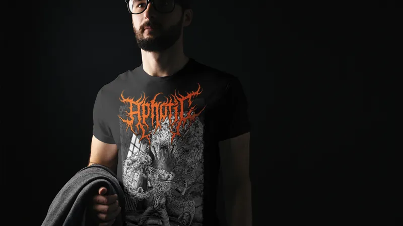
The tour shirt
The same artwork, on the merch table.
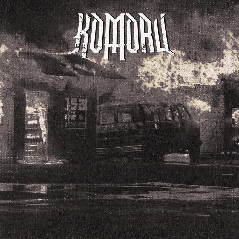
KOMORU, the EP
The lettering from above, on a cover.
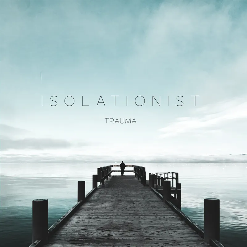
Isolationist, Trauma
A single cover, mostly sky.
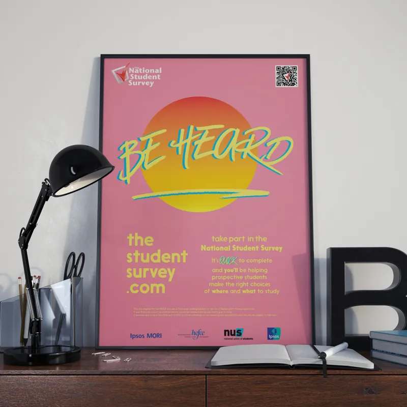
Be Heard
A poster for the National Student Survey.